Building a Design System Inside a Live Product
Design System Architecture Under Constraint — Game Caviar. When I joined as the only product designer, I inherited a UI held together by copy-pasted components with no single source of truth. Once I'd ramped up, I made fixing it a priority and built the system live, underneath a product that couldn't afford to stop shipping.
Highlights
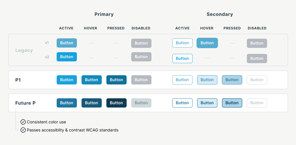
- 0.1Button consistency — three generations of inconsistent styles converged into one connected, WCAG-compliant component
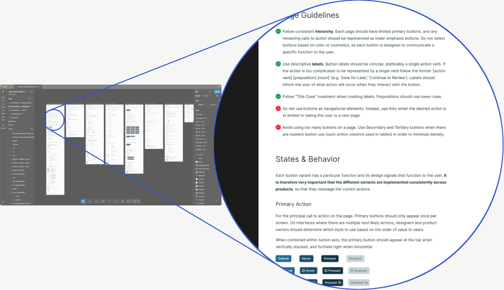
- 0.2Component documentation pairing UX usage guidelines with exact engineering build specs
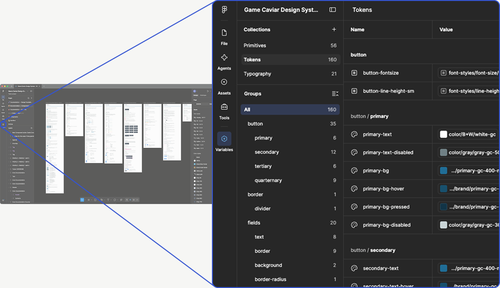
- 0.3Figma Variables token architecture — Primitives, Tokens, and Typography collections wired as connected variables
- 0.4White-label extension — the same architecture managing per-client theming via Figma Modes
The situation
A UI with no single source of truth.
Copy-pasted components, three generations of buttons, and a library that had drifted from itself.
When I joined as the sixth employee and only product designer, the interface was held together by copy-pasted components. Buttons alone had three generations of inconsistent styles, and there was no single source of truth to design from or build from. Once I'd ramped up, I raised it with the CEO in May 2025 as a priority to address immediately, before it got harder to untangle.
The challenge
No time to stop and fix the foundation.
A 3-person engineering team, mid-migration, with a roadmap that couldn't pause.
A live Django-to-React migration was already running, with no appetite — and no time — to pause feature work to fix a component library that had drifted from itself.
The approach
Sequence the system into the roadmap, not around it.
Every new feature became an opportunity to add a properly connected, documented component.
A custom naming convention bridged our styles to Tailwind. Figma Variables kept components consistent. When I found a real accessibility gap, I made the pragmatic call: default the new button to the existing live color rather than block progress on a full color-system overhaul — so it updates everywhere the moment we're ready. It's the first of the operating principles on How I Operate.
1.0button-consistency.png
1.1Documentation library
1.2Token architecture
Craft highlights
The documentation is the point, not the byproduct.
Design changes push toward code — and toward the tools that will design the next feature.
We're setting up Figma → MCP → git → staging, so design changes push directly to code — powered by documentation covering both UX usage and exact build specs, so the same documentation can feed AI tools like Figma Make and Claude Design for faster, system-grounded concepting later.
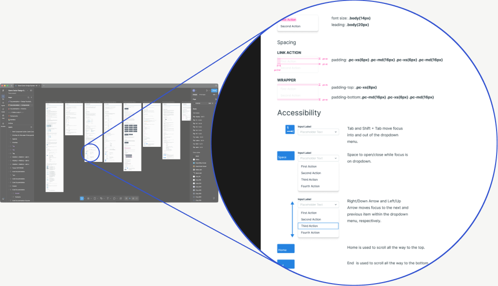
1.3MCP build reference
Outcome, so far
A live, in-progress body of work.
Component instances connected to the system have more than doubled since rollout began. Cards, tabs, and drawers have been rebuilt on the new system and are in active use. Engineers report faster implementation in the areas the system now covers. The work has been tracked alongside the roadmap in Linear since January 2026, and it's ongoing. The pipeline going into production is the next milestone — this case study will update when it does.